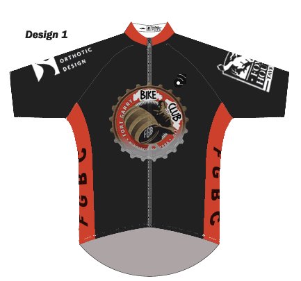
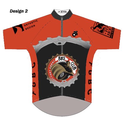
I know I'm just an outsider throwing in his two cents but as an unbiased opinion I must say #2 is the sweetest. Nice colour contrast, shoulder logos. Very nice!
I like 1, then 3 minus the gold lines on the sleaves and the gold swoosh over the gut. I would be fine with whatever the majority wants. They are all pretty good.
What would the printing be made of. I don't like that plasticy sticky stuff?
Number 3-No I like the large gear on #2-very edgy but I'd have to go with #1 for overall taste. Black is a "slimming color" which may be of interest to a group of "40ish" riders. Is it possible to change the "Bike Club" words on the primary logo to look more font based as opposed to something that Quinn wrote? Have I said to much? This is fun! Oh yeah, could we swap the Snider Orthotic Design Logo with the Fort Garry Bike Club Logo?


7 comments:
Hmmmm.....
I know I'm just an outsider throwing in his two cents but as an unbiased opinion I must say #2 is the sweetest. Nice colour contrast, shoulder logos. Very nice!
I like #1 for design and colour and #2 for design (I have enough orange jerseys)
I like 1, then 3 minus the gold lines on the sleaves and the gold swoosh over the gut. I would be fine with whatever the majority wants. They are all pretty good.
What would the printing be made of. I don't like that plasticy sticky stuff?
Will the back pockets hold at least 3 beers?
Important questions I think.
#1 gets my vote.
#1 please.
I will talk to the guy at the fox and hounds and secure the funds. I think he wanted to see something first.
well done barg!
Number 3-No
I like the large gear on #2-very edgy but I'd have to go with #1 for overall taste. Black is a "slimming color" which may be of interest to a group of "40ish" riders. Is it possible to change the "Bike Club" words on the primary logo to look more font based as opposed to something that Quinn wrote? Have I said to much? This is fun! Oh yeah, could we swap the Snider Orthotic Design Logo with the Fort Garry Bike Club Logo?
Post a Comment